PROJECT DESCRIPTION & GOALS
This project focused on creating an original motion title sequence for Fantastic Four. The goal was to
develop a cohesive visual language using line animation, color blocking, and quick transitions;
showcase character reveals through guided motion; use typography and composition to create a
cinematic, modern introduction; and practice motion storytelling, pacing, and hierarchy.
DESIGN APPROACH — HOW I ARRIVED AT THE SOLUTION
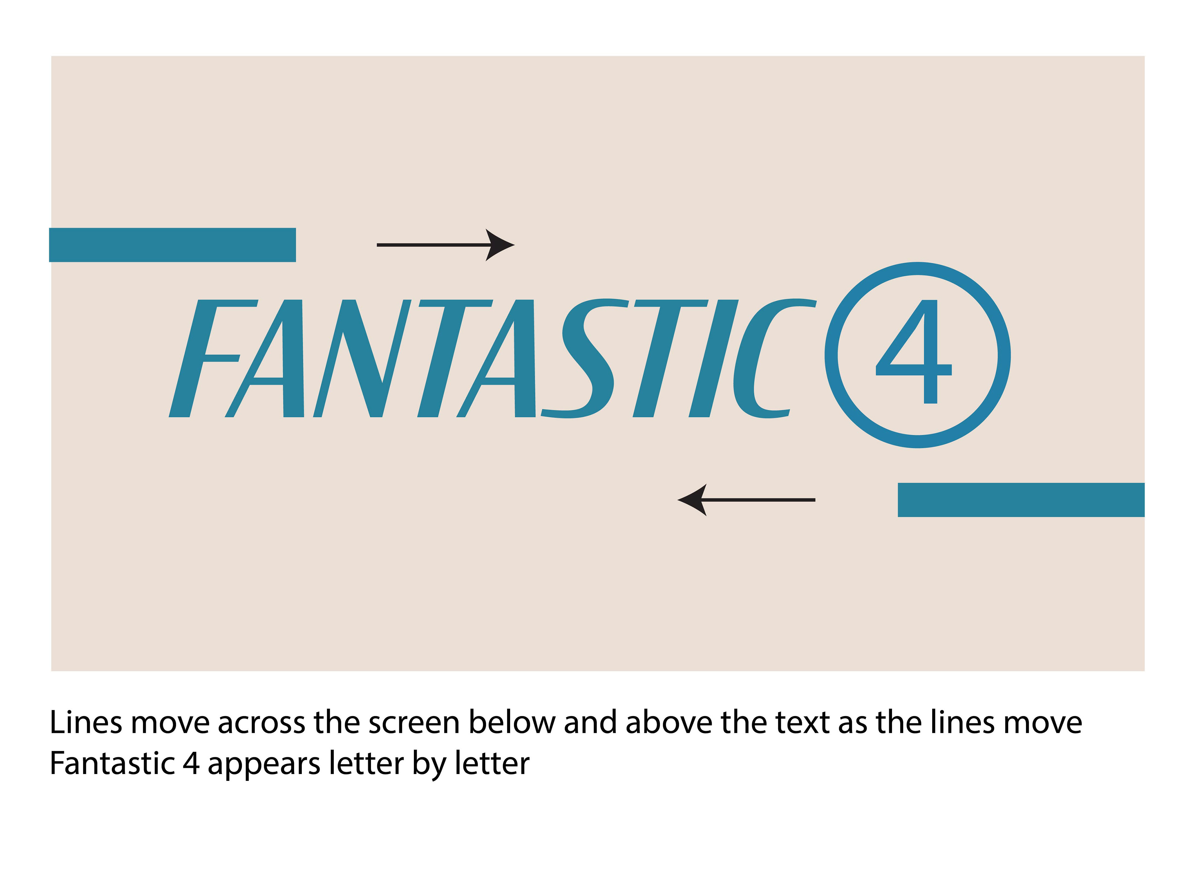
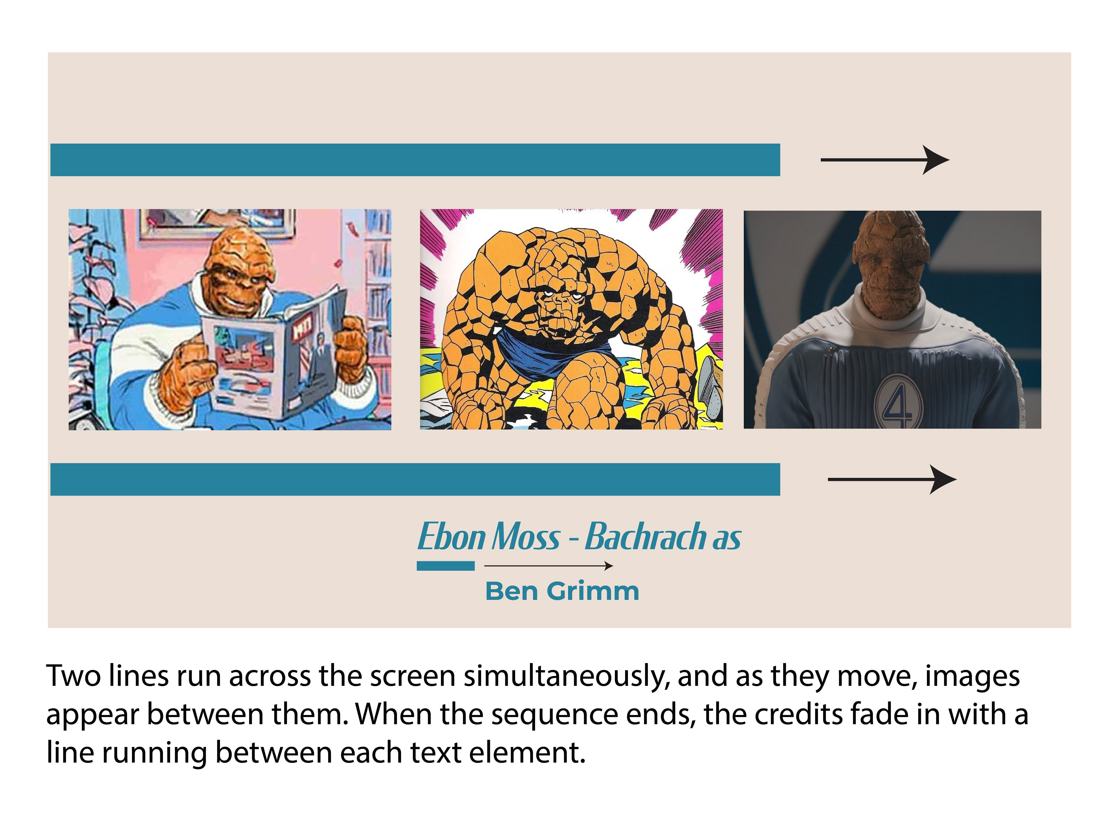
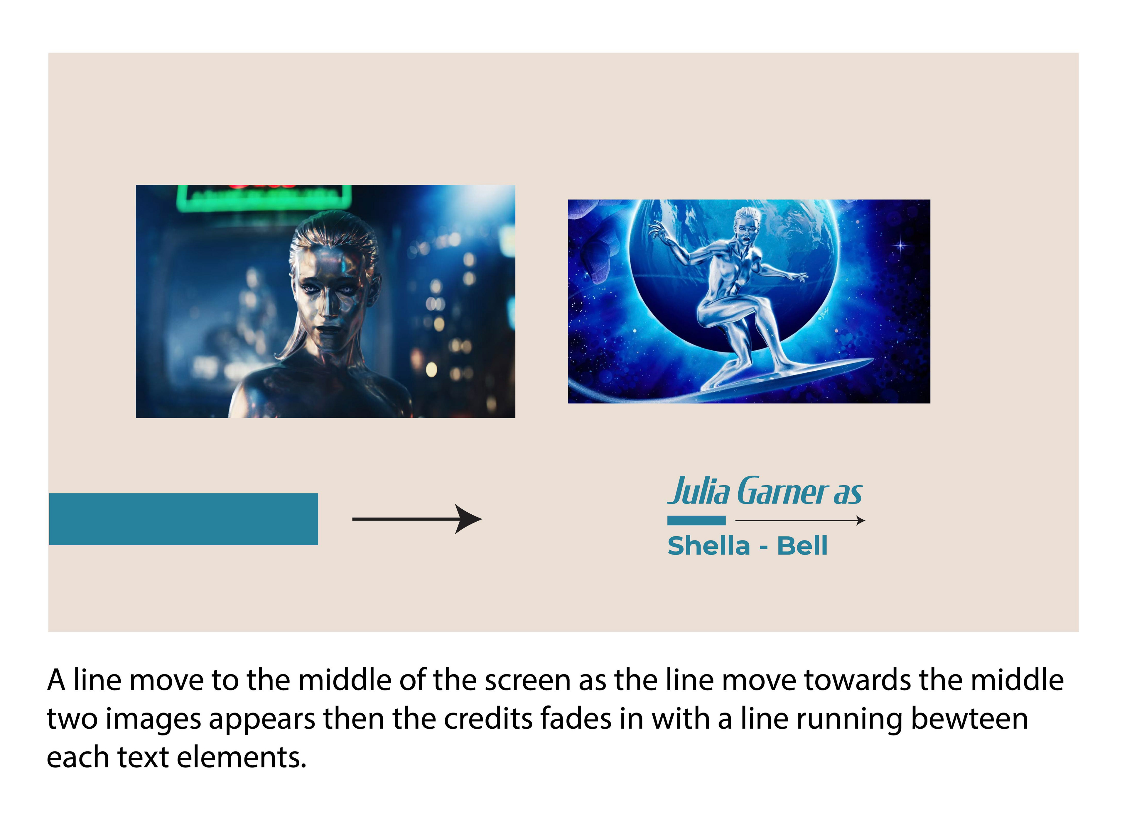
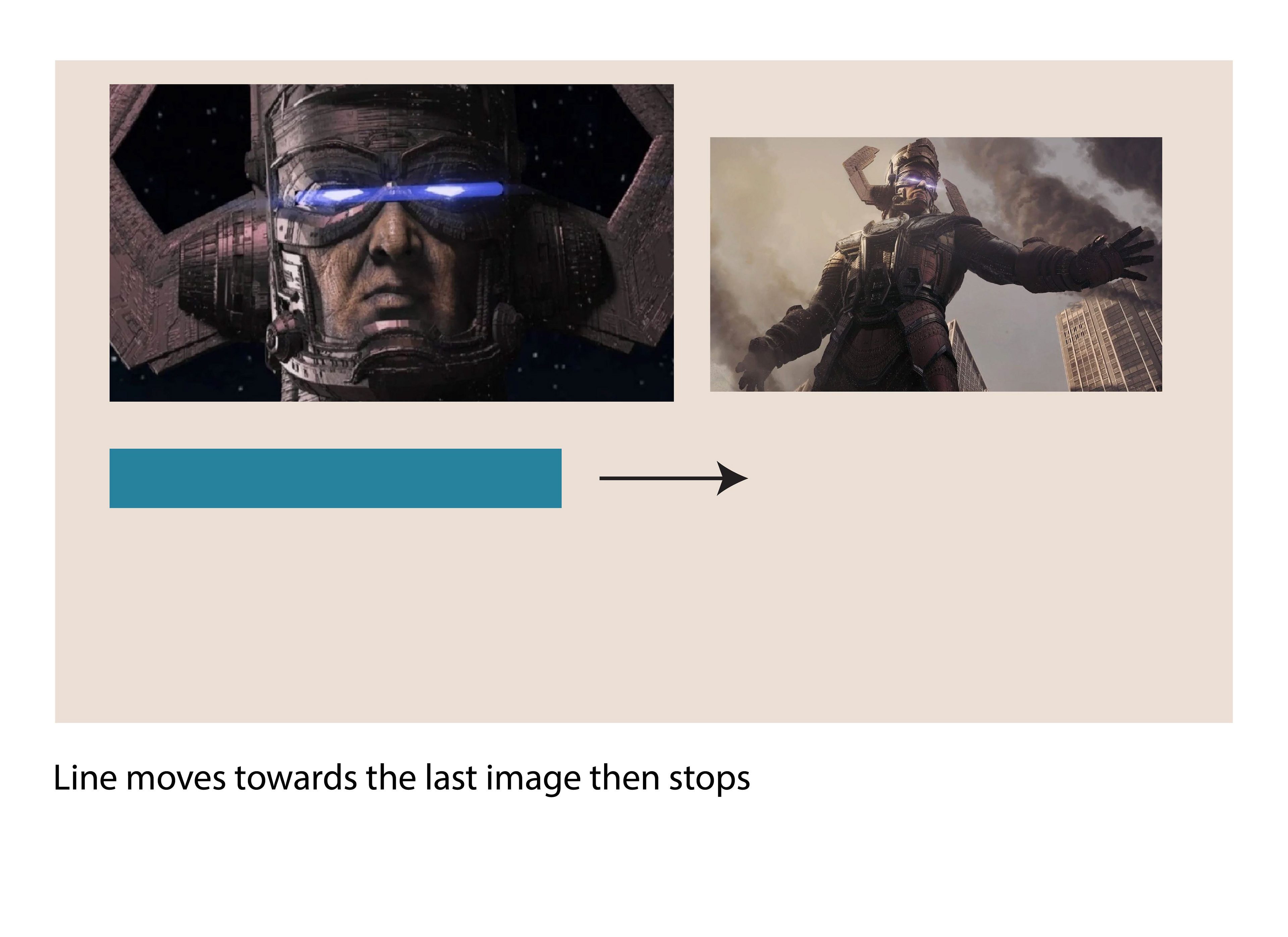
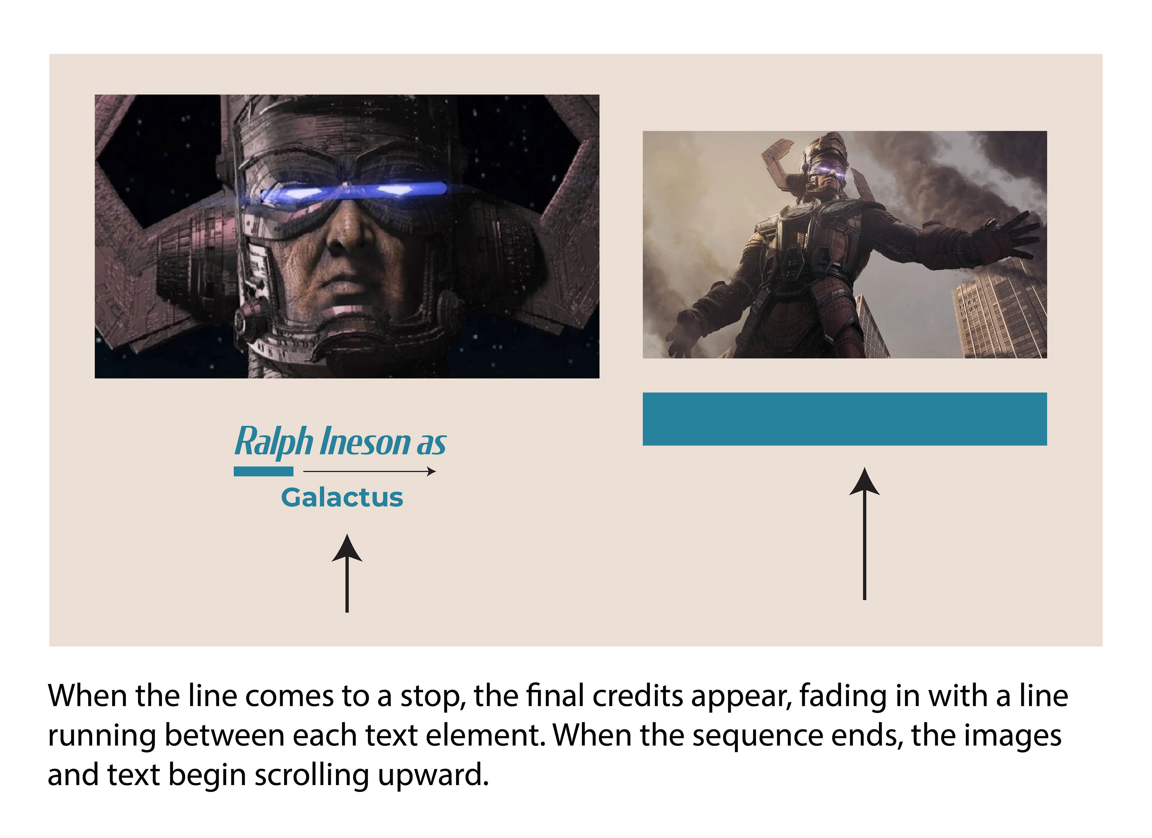
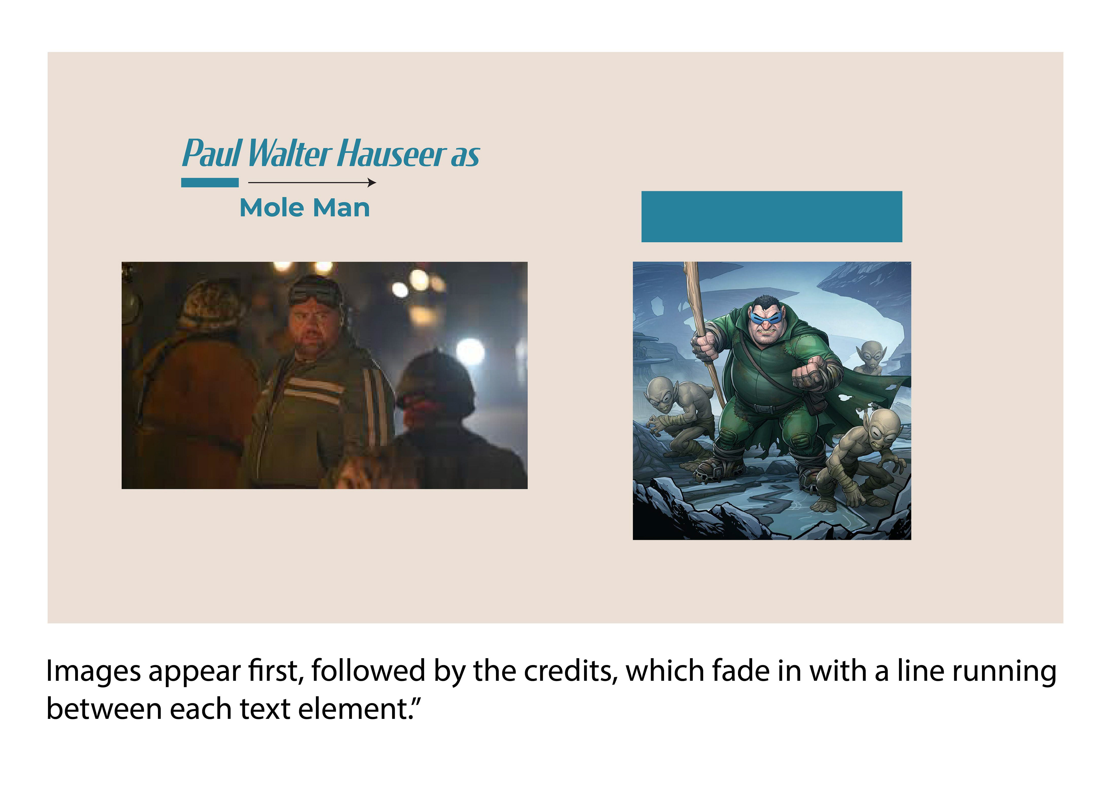
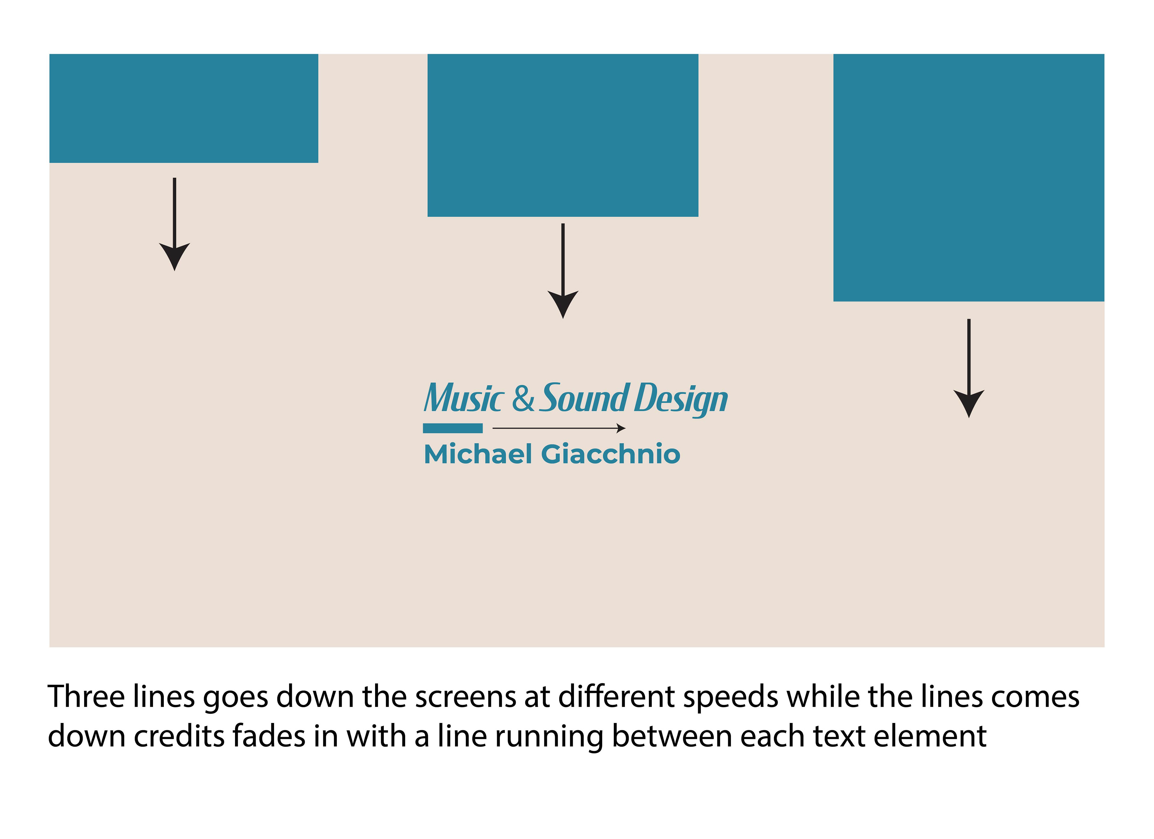
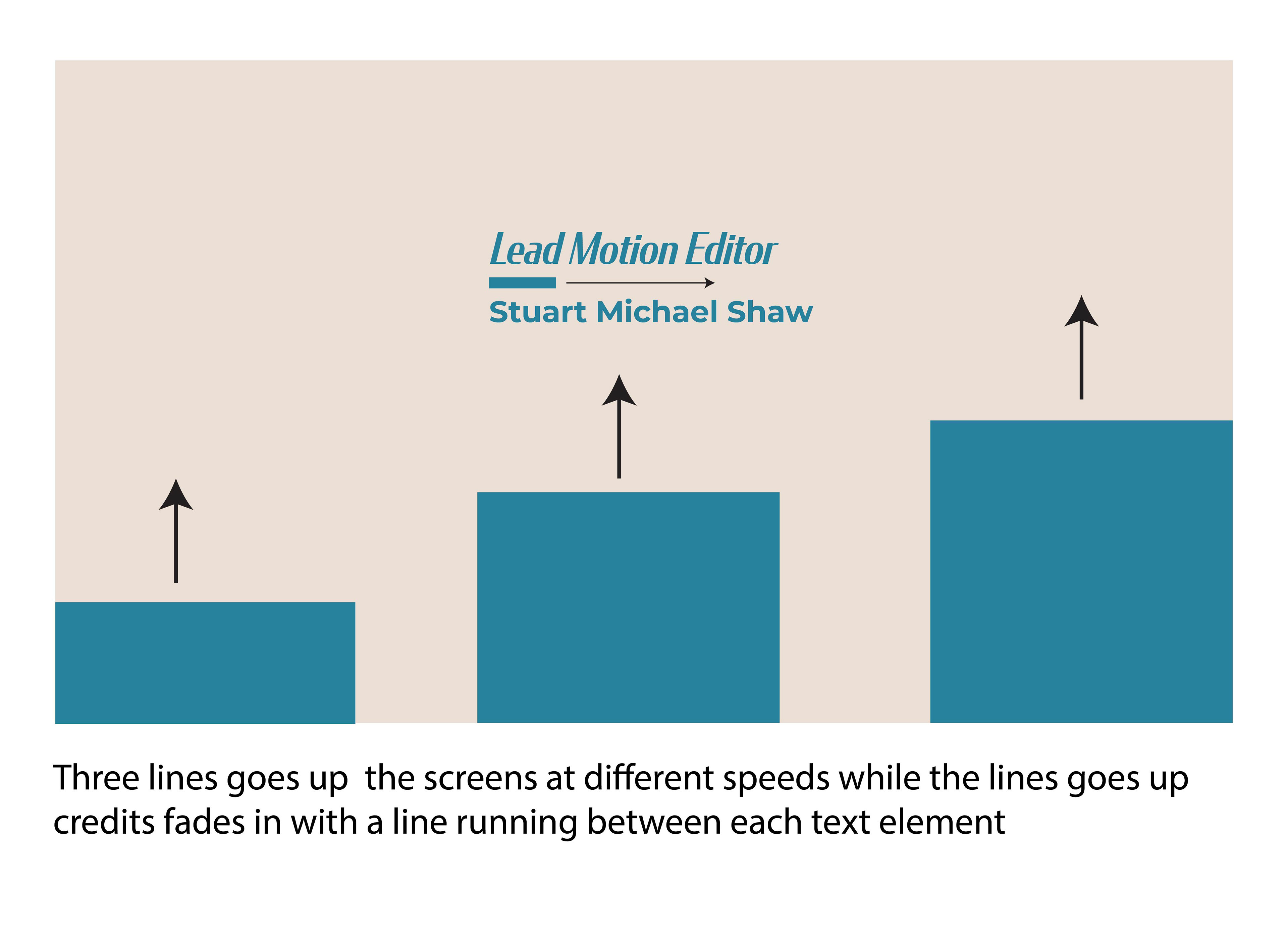
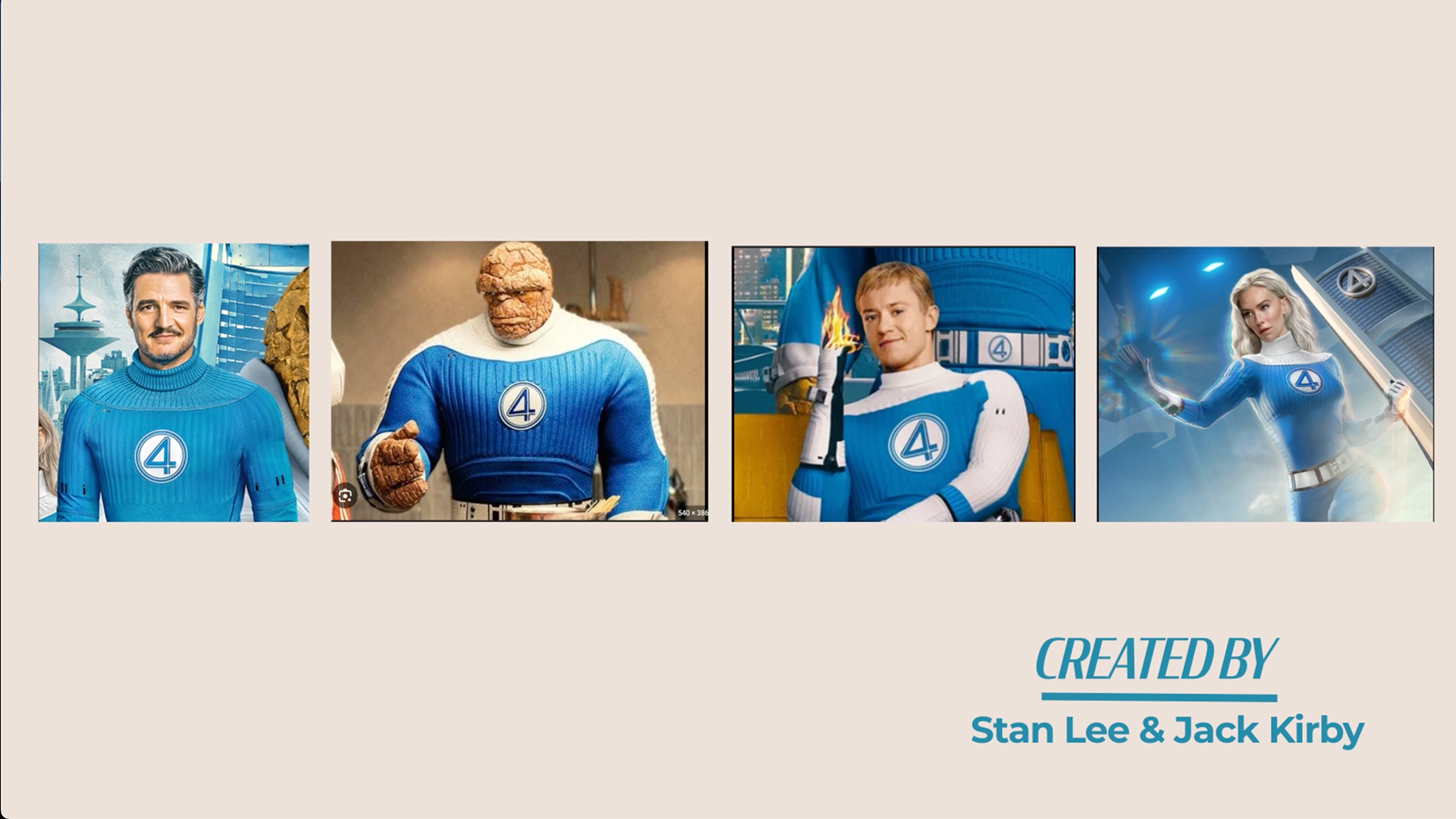
1. Establishing the Visual Language I built the sequence around moving lines, sliding shapes, and
controlled directional animation, creating structure and rhythm throughout. Horizontal and vertical lines
guided reveals, while blue rectangles added dynamic transitions. 2. Storyboarding & Structure A
complete storyboard was created to plan every moment of the sequence. Rules such as "line stops →
credits fade in" ensured consistent pacing. 3. Color, Styleframes & Composition A muted beige
background paired with a blue accent color created visual harmony. Composition focused on negative
space and clean layouts. 4. Typography Condor Medium Condensed Italic was used for titles and
names, while Montserrat Bold provided clear, supporting text.
PROCESS ELEMENTS INCLUDED
• Storyboard frames • Stills from the final video • Reflections and techniques learned •
Typefaces used
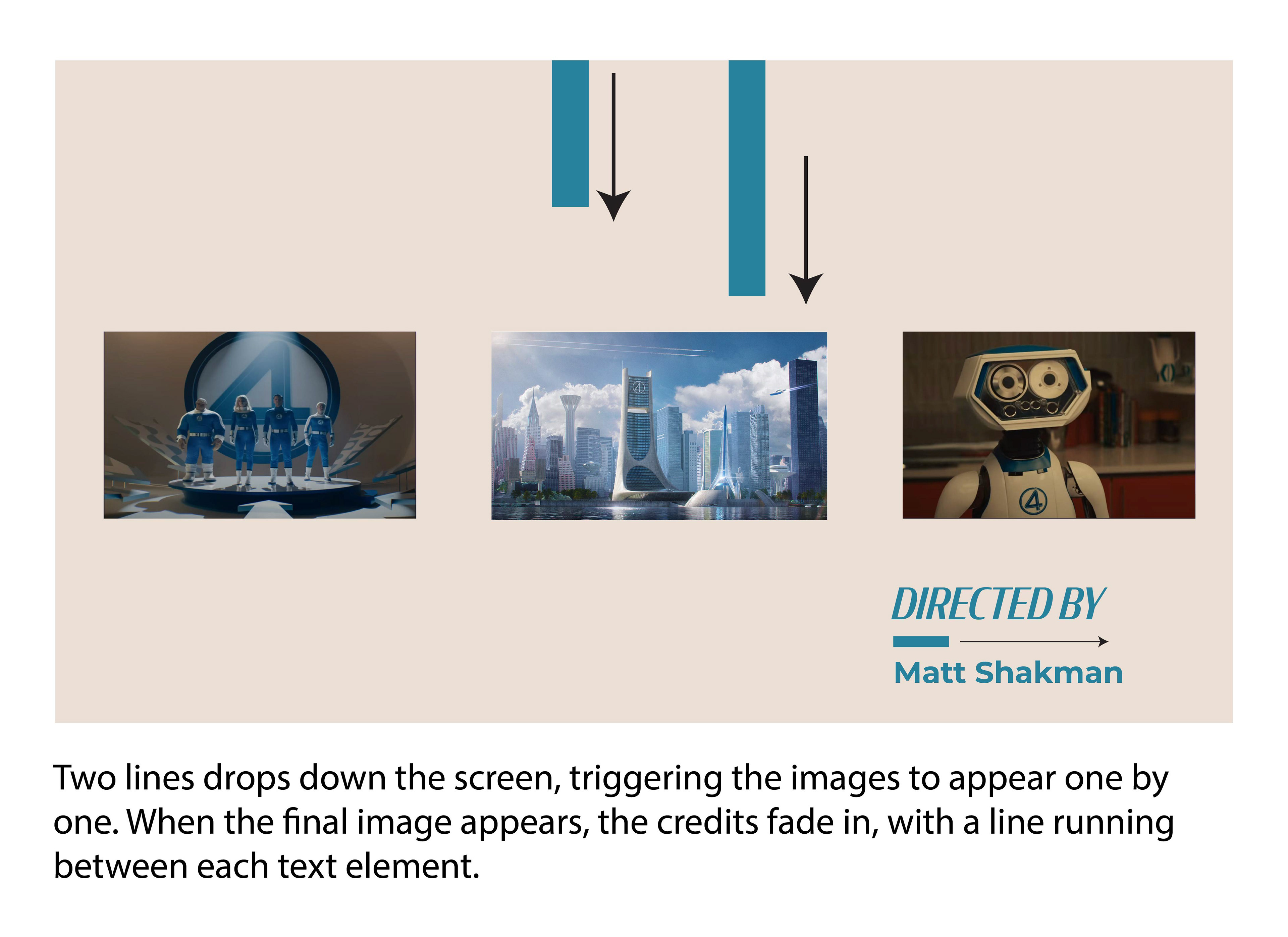
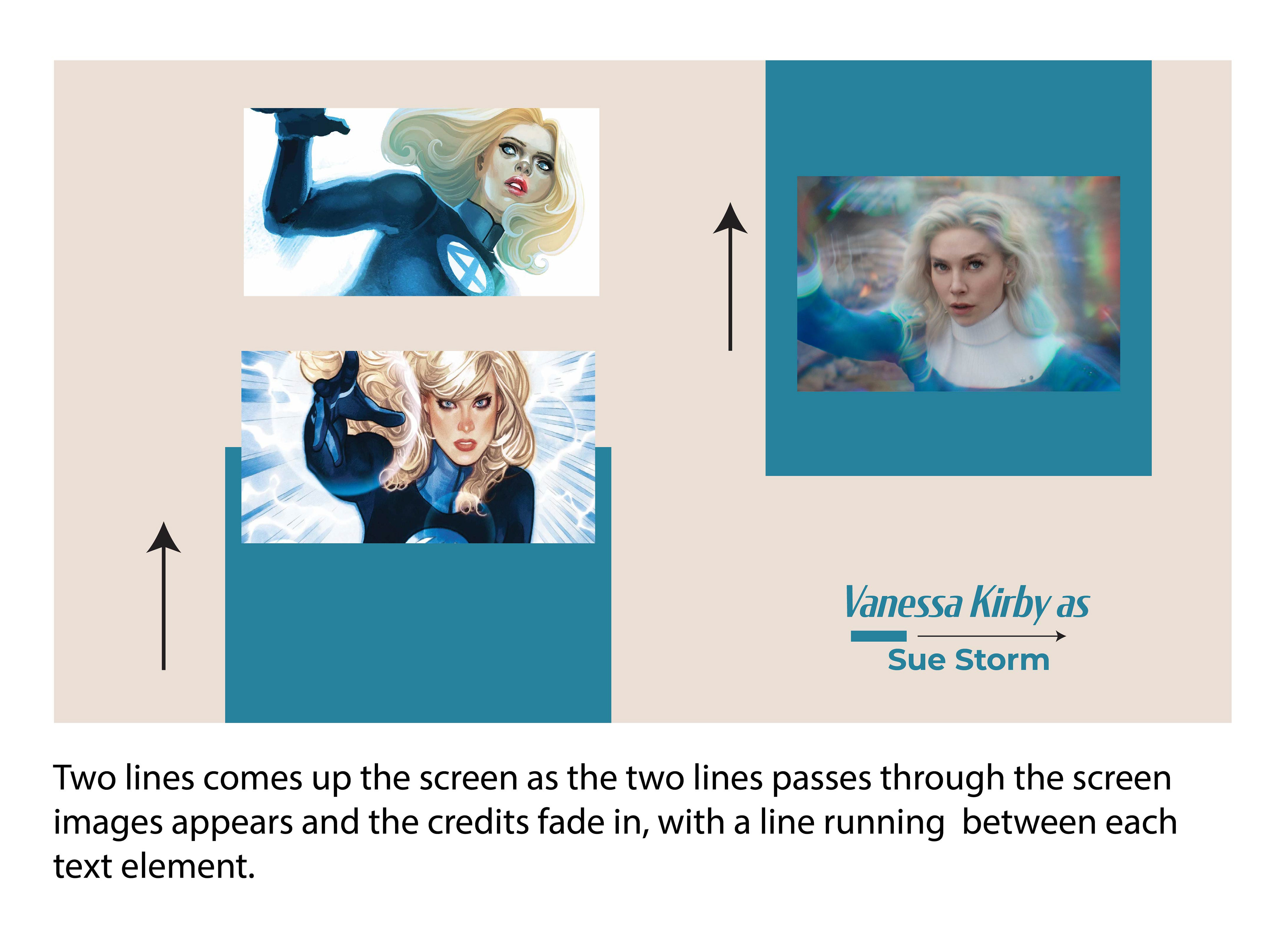
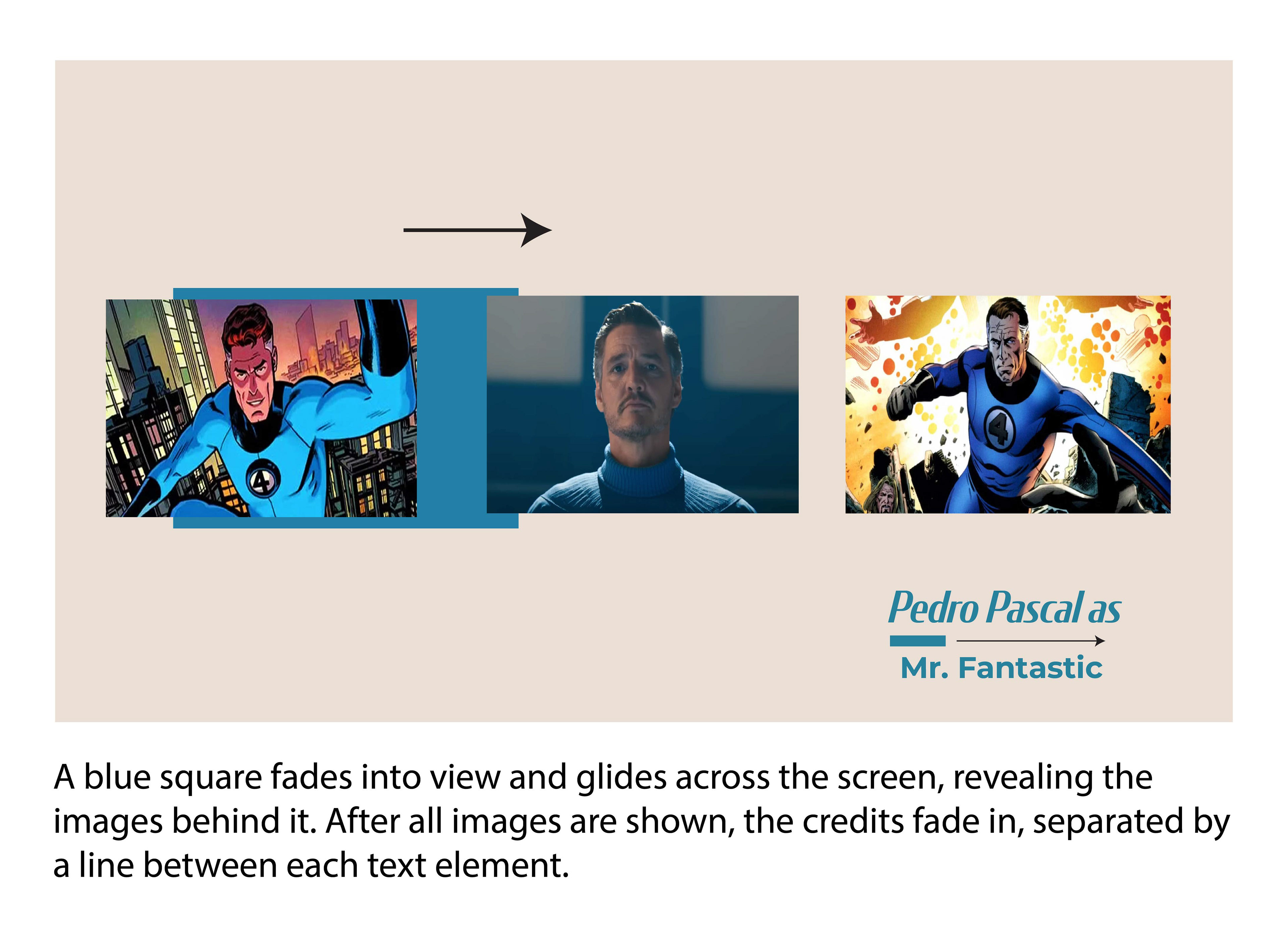
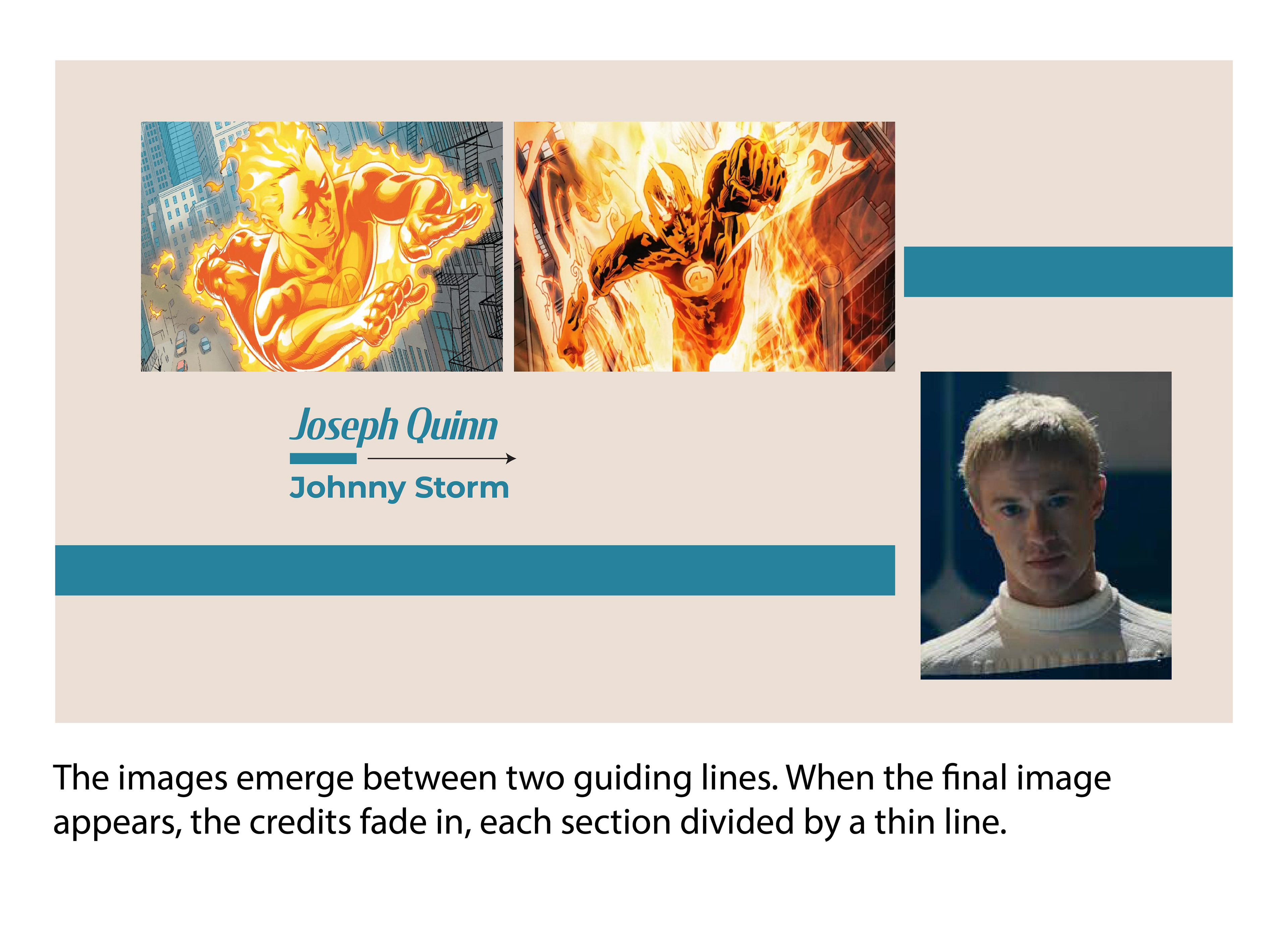
STORYBOARD
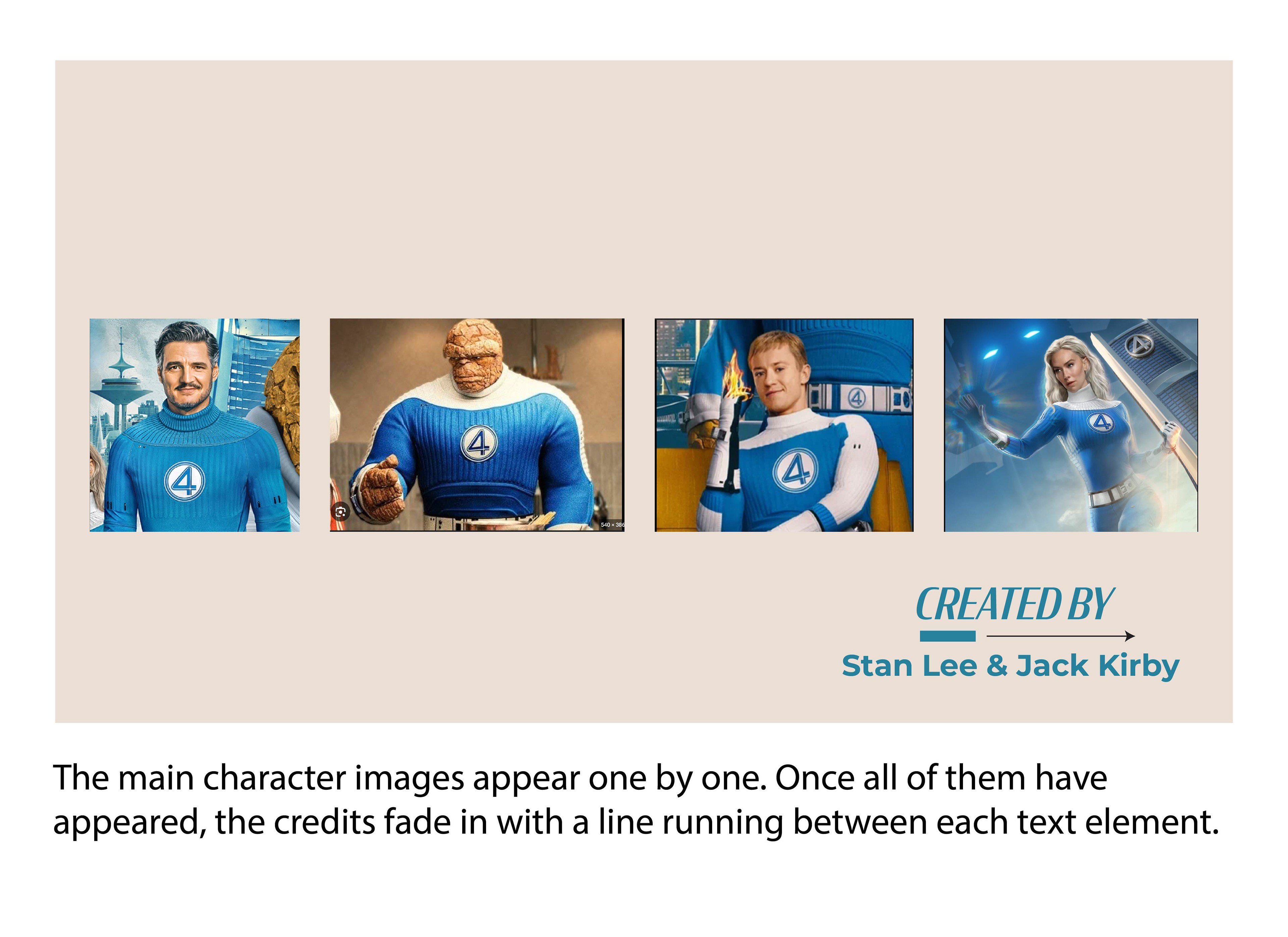
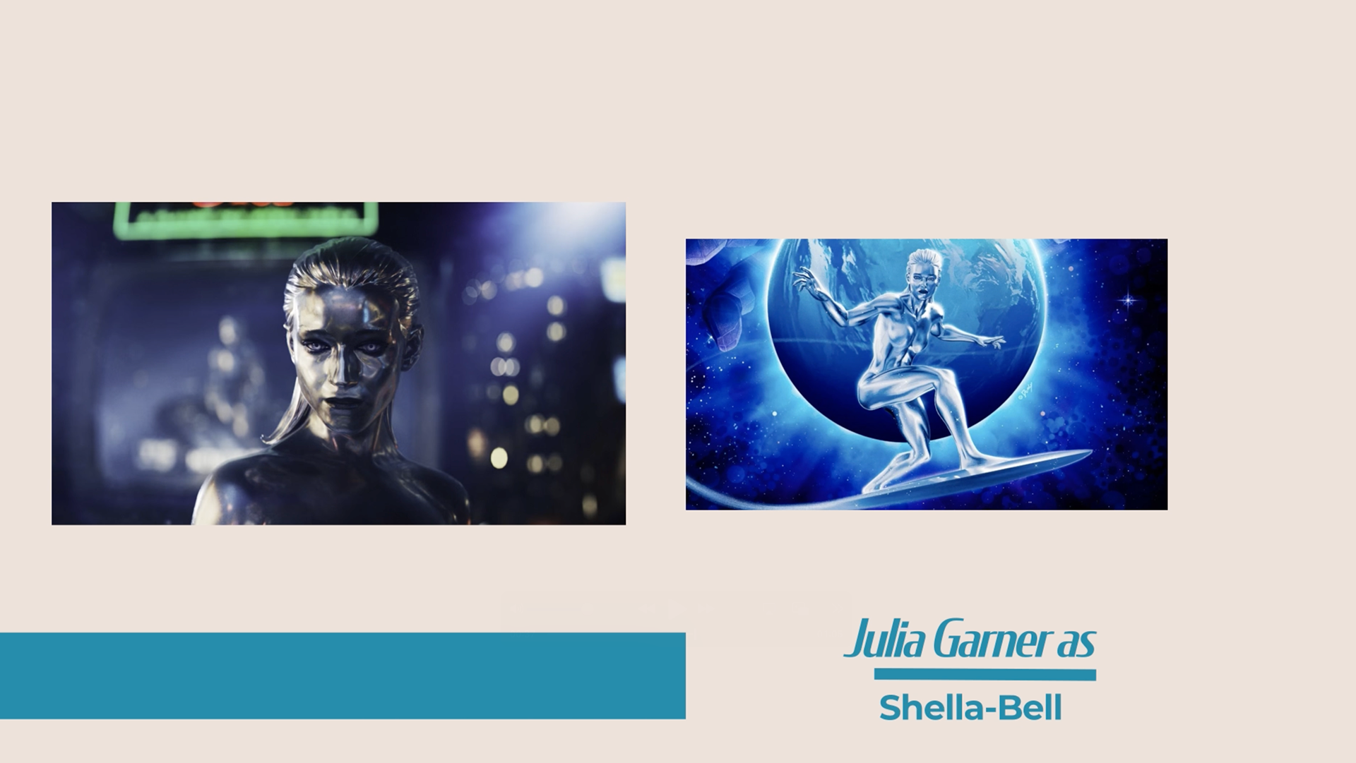
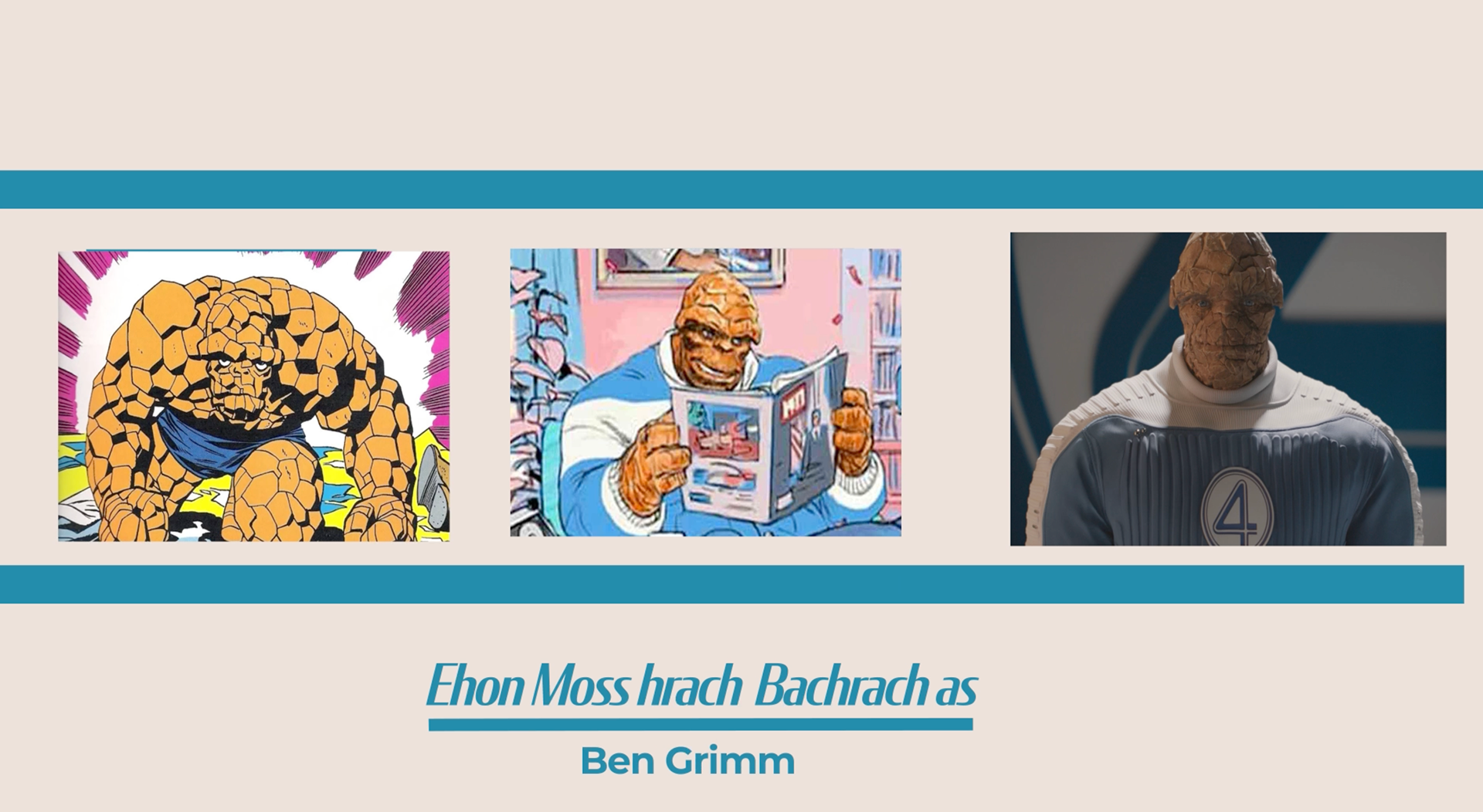
STILLS FROM FINAL VIDEO
REFLECTION
This project strengthened my motion design workflow, particularly in planning sequences, establishing
visual rhythm, and designing cohesive transitions.
FINAL VIDEO