PROJECT DESCRIPTION & GOALS
This project involved designing a kinetic typography video for “Ace Trumpets” by The Clipse. The goal
was to use movement, pacing, and bold typographic composition to visually interpret the rhythm and
style of the lyrics. The sequence emphasizes contrast, timing, and character personality through
animated text, color shifts, and structured layouts.
DESIGN APPROACH — HOW I ARRIVED AT THE SOLUTION
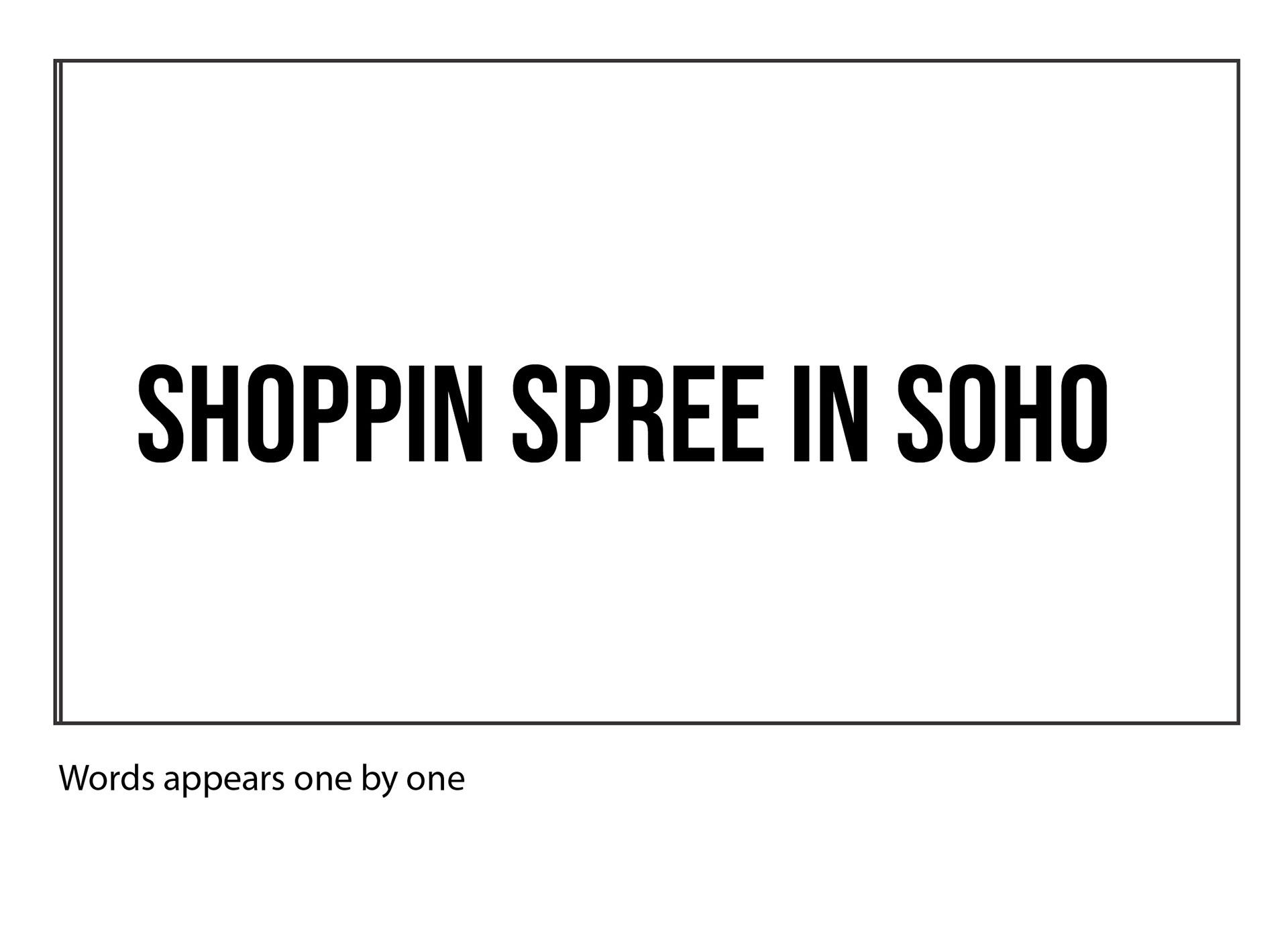
1. Developing the Motion Language The sequence was built around sharp cuts, rhythmic word
entrances, dynamic scaling, and directional movement. Each lyric section received a motion pattern to
match tone and energy. 2. Storyboard Planning A full storyboard was created to map lyric timing,
transitions, and movement paths. This ensured that every moment followed a clear structure and
supported the flow of the track. 3. Typography & Visual Style Bebas Neue Regular provided bold,
expressive headline text, while Helvetica offered clean secondary details. High-contrast black and white
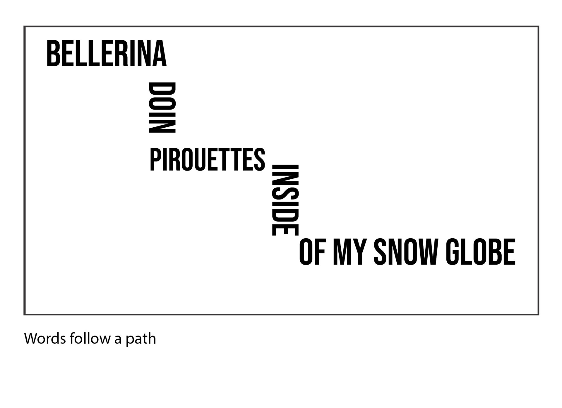
frames reinforced readability and dynamic impact. 4. Composition & Rhythm Layouts alternated
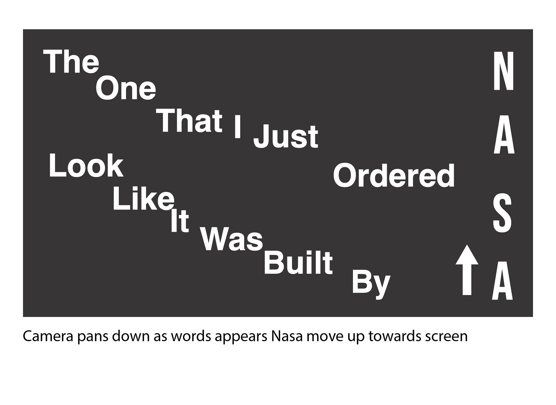
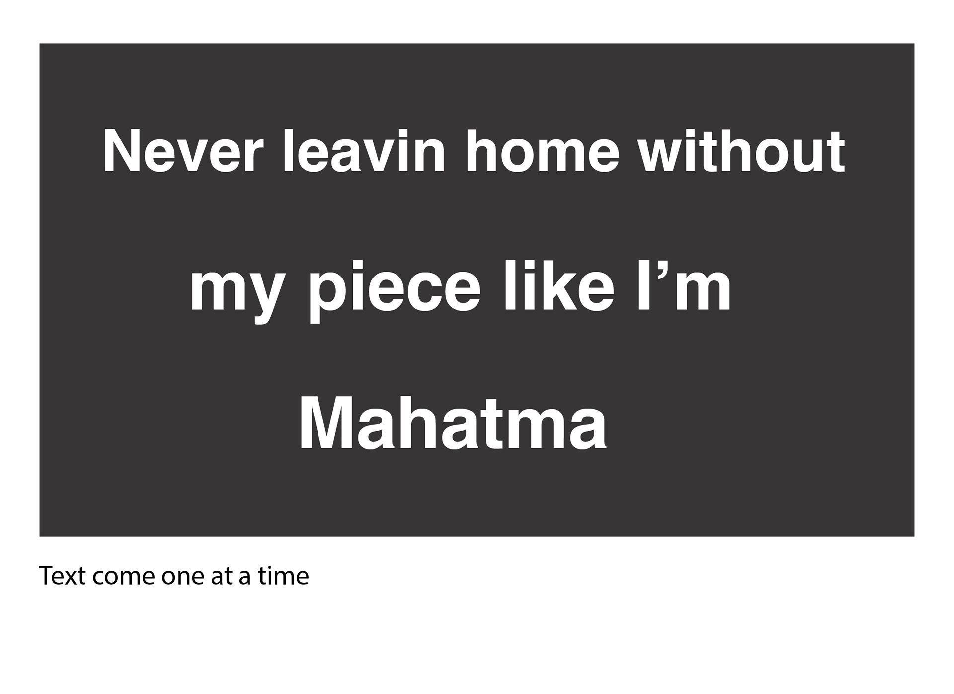
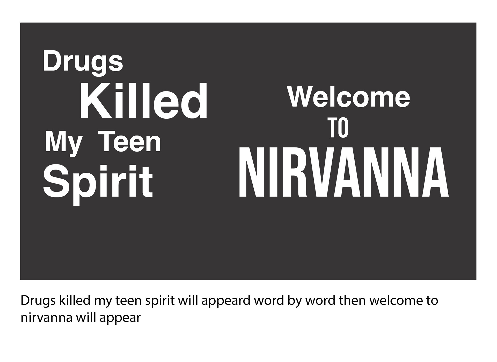
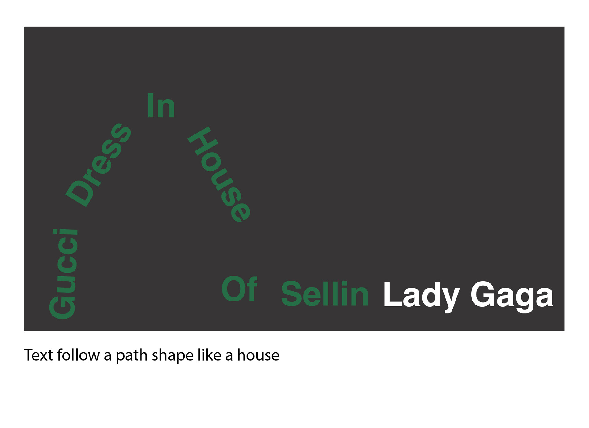
between tight compositions and open negative space to mirror the song's intensity. Text followed
custom paths — arches, bounces, and directional sweeps — depending on lyric emphasis.
PROCESS ELEMENTS INCLUDED
• Storyboard frames • Key stills from the video • Reflections and techniques learned •
Typefaces used (Bebas Neue Regular, Helvetica)
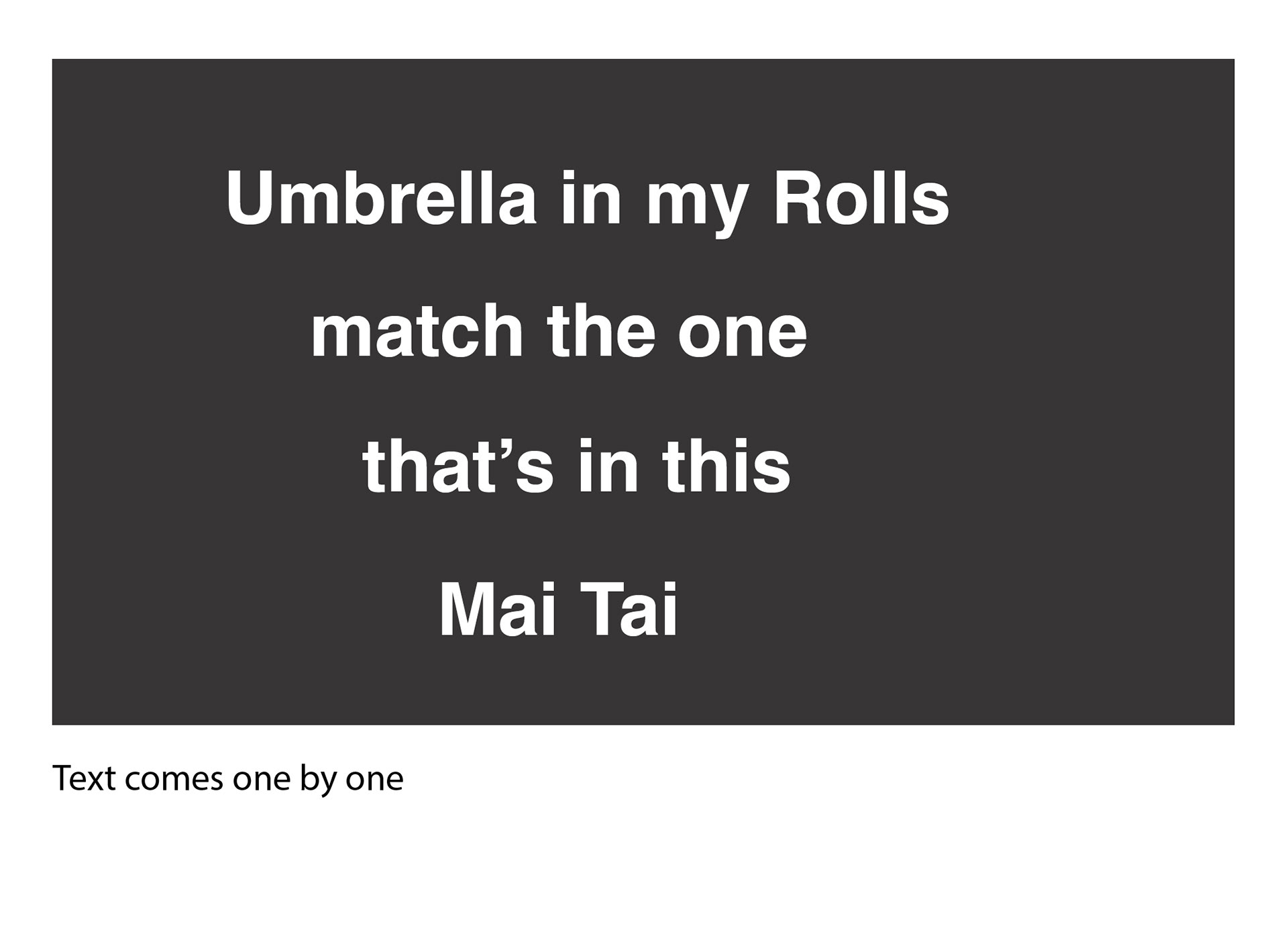
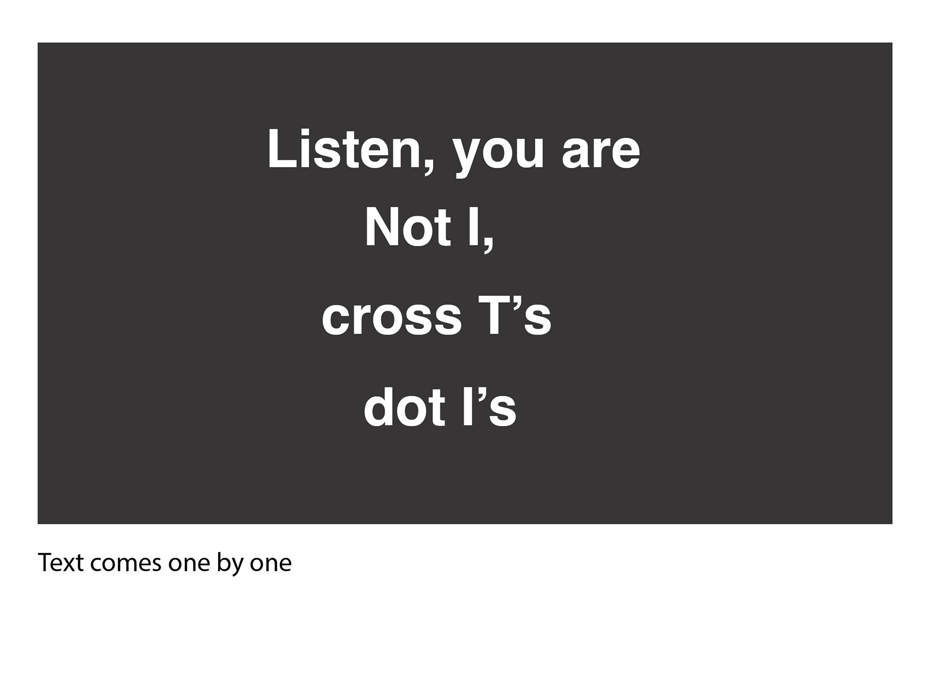
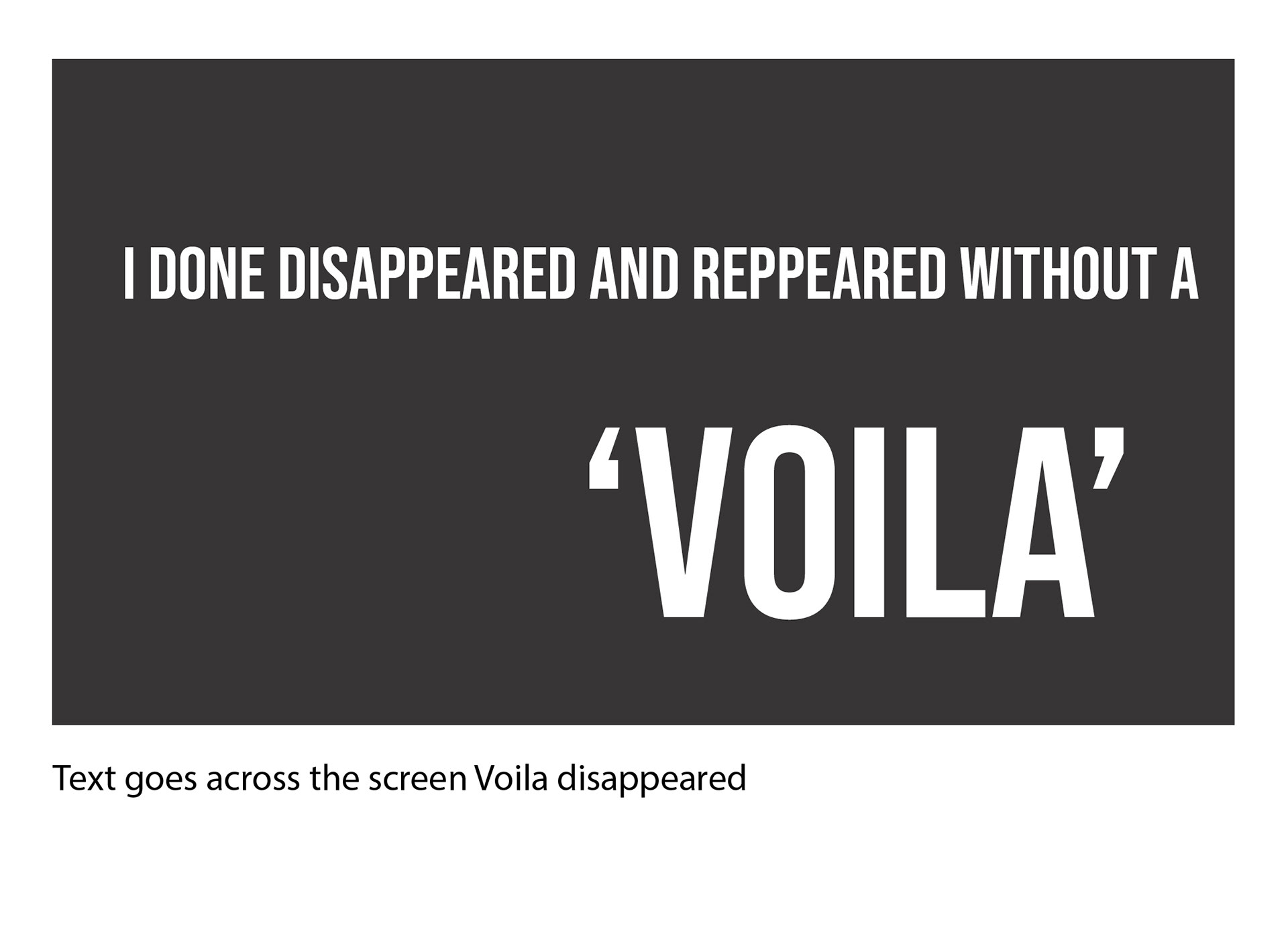
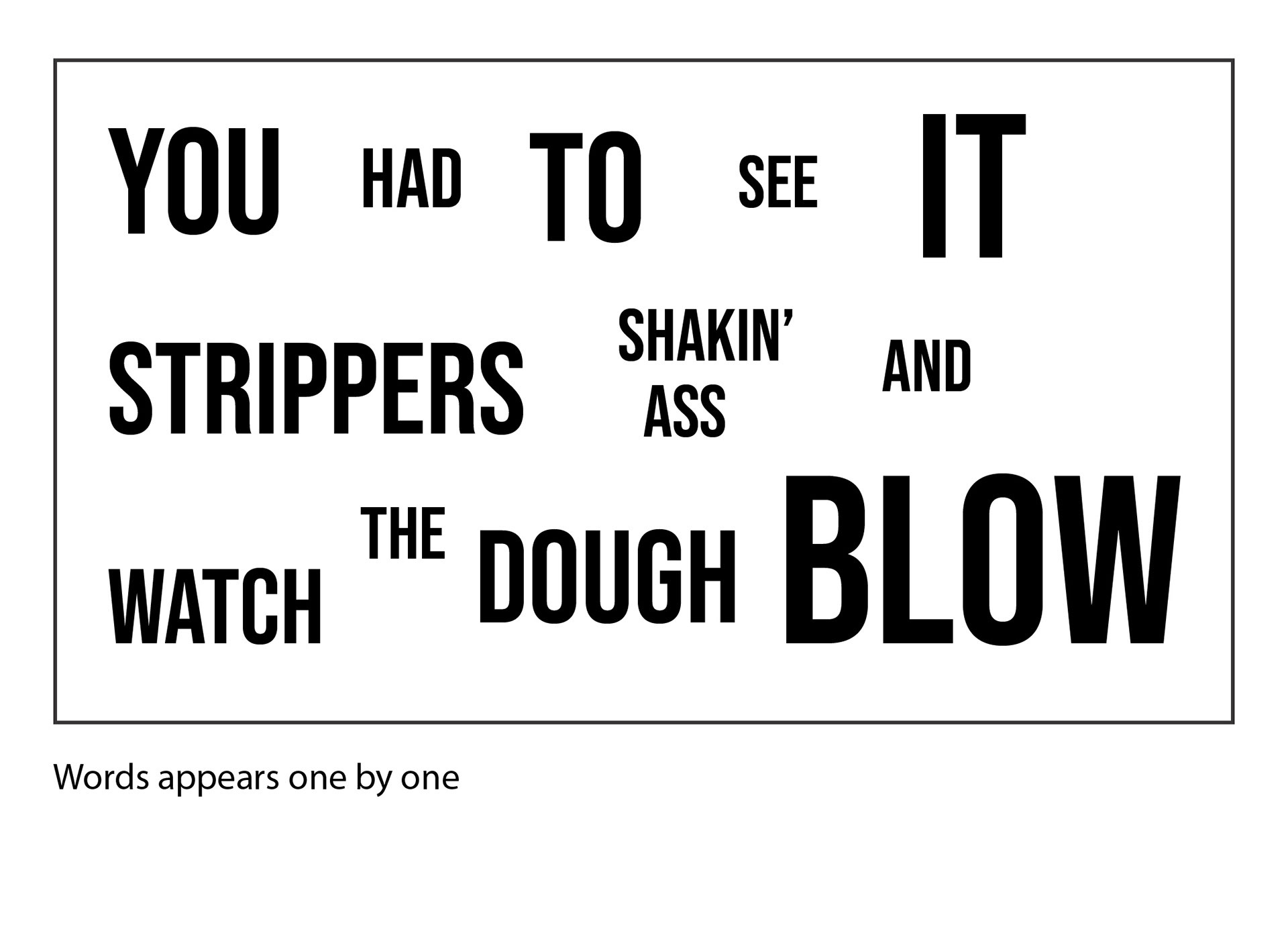
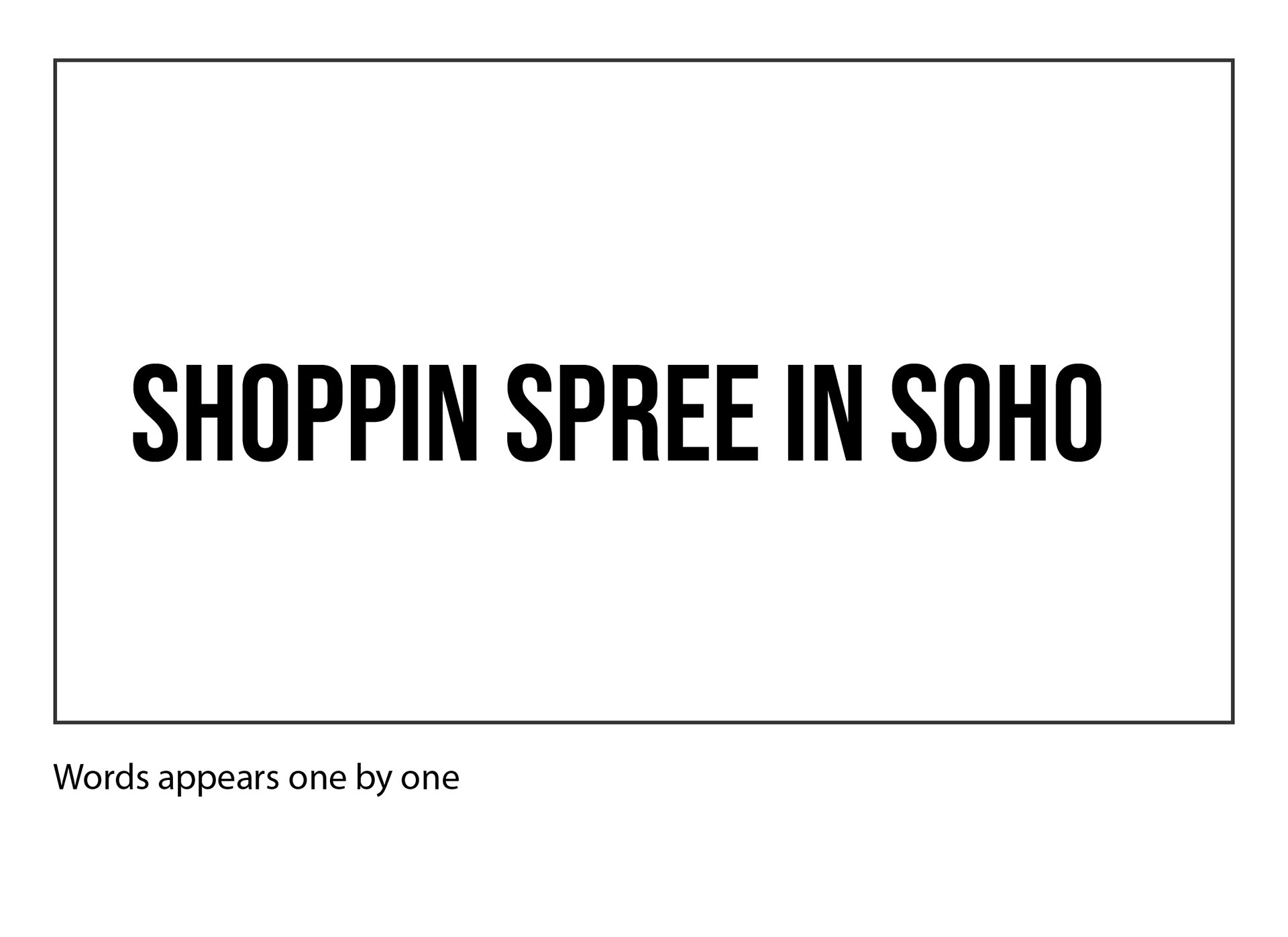
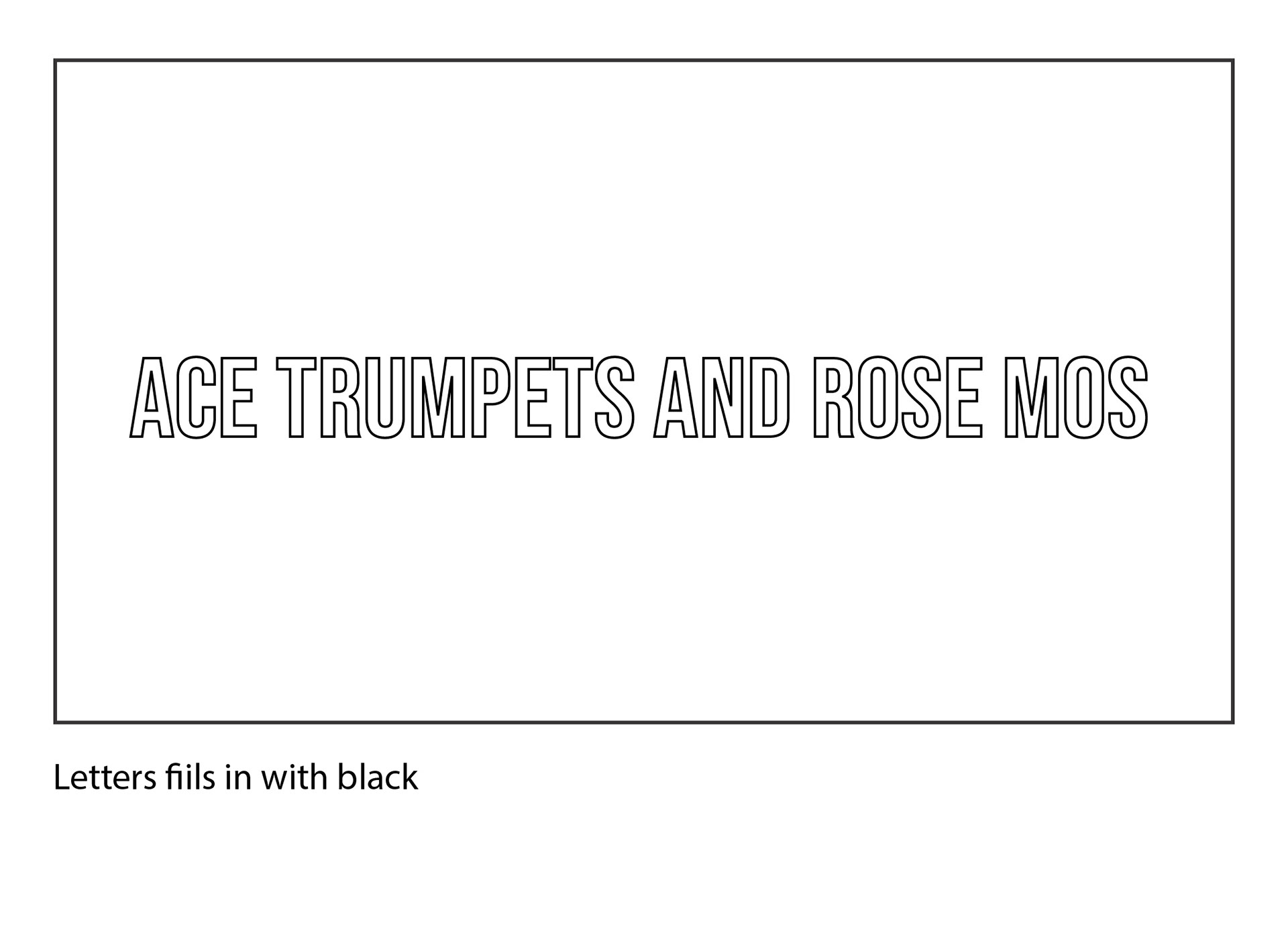
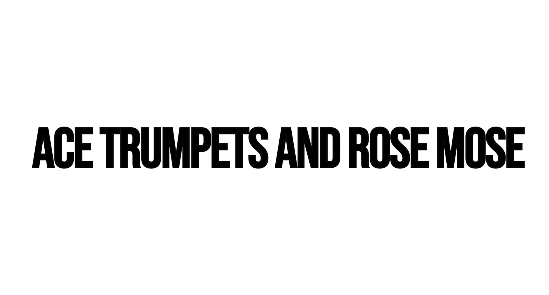
Storyboard


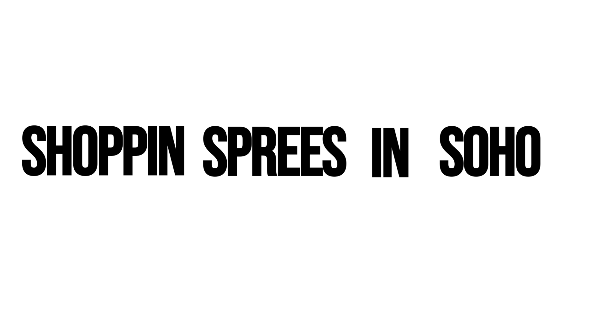
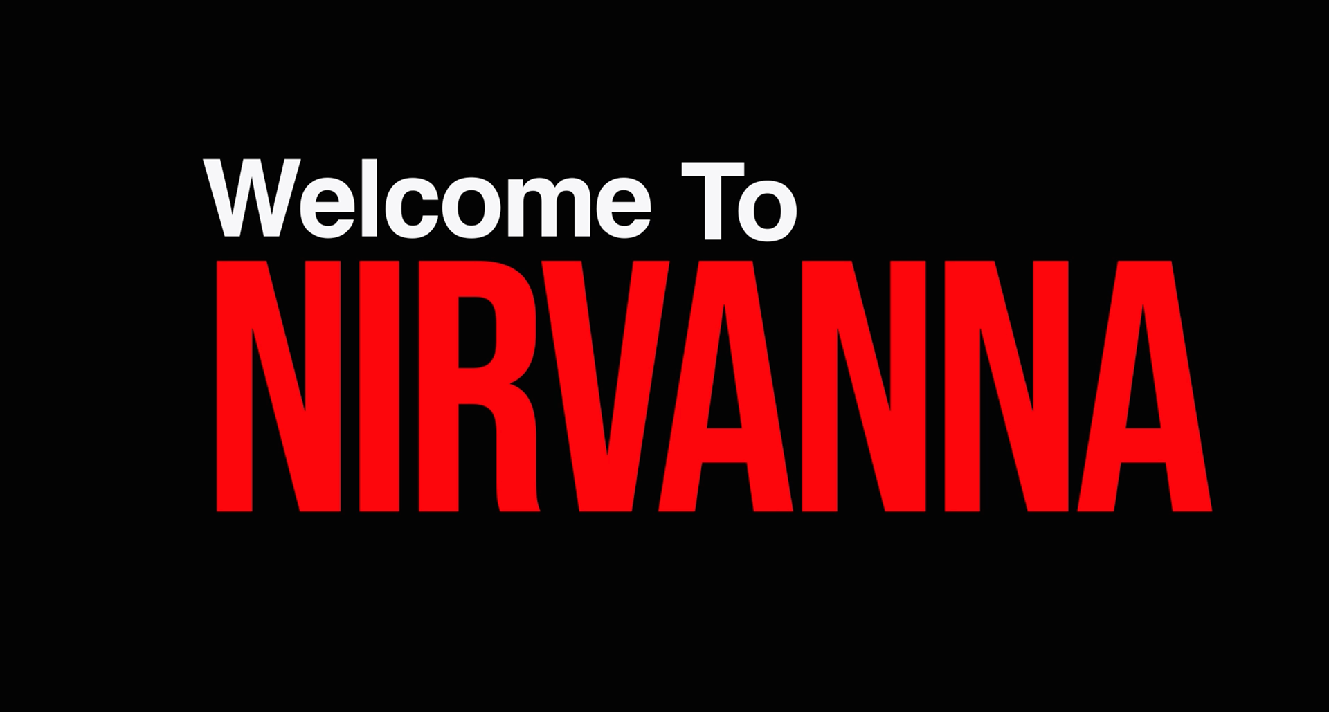
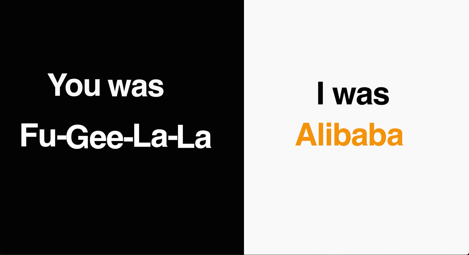
STILL FROM FINAL VIDEO
REFLECTION
This project strengthened my kinetic type skills, especially timing animation to music and planning
text-based movement. I also improved my ability to structure lyric pacing visually while balancing style
with readability. Feedback highlighted strong visual rhythm and clear typographic hierarchy throughout
the sequence.
FINAL VIDEO